Brief
Renowned artist hostel, Flotsam & Jetsam, catapulted La Union from a tranquil surf town into a bustling hotspot for backpackers and tourists alike. Known for its budget-friendly accommodations and vibrant nightlife, including a popular bar and dancefloor, F+J attracted visitors from all over the world.
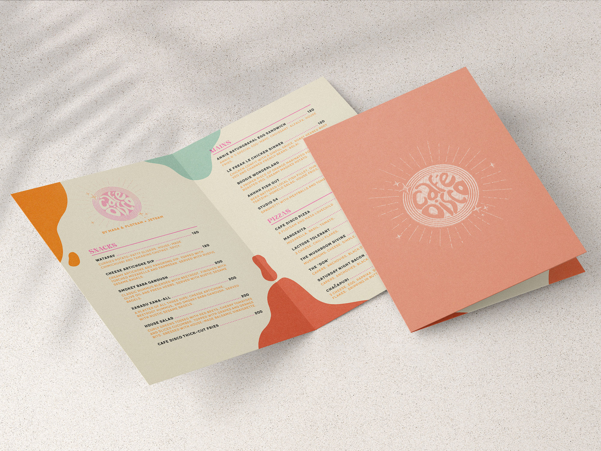
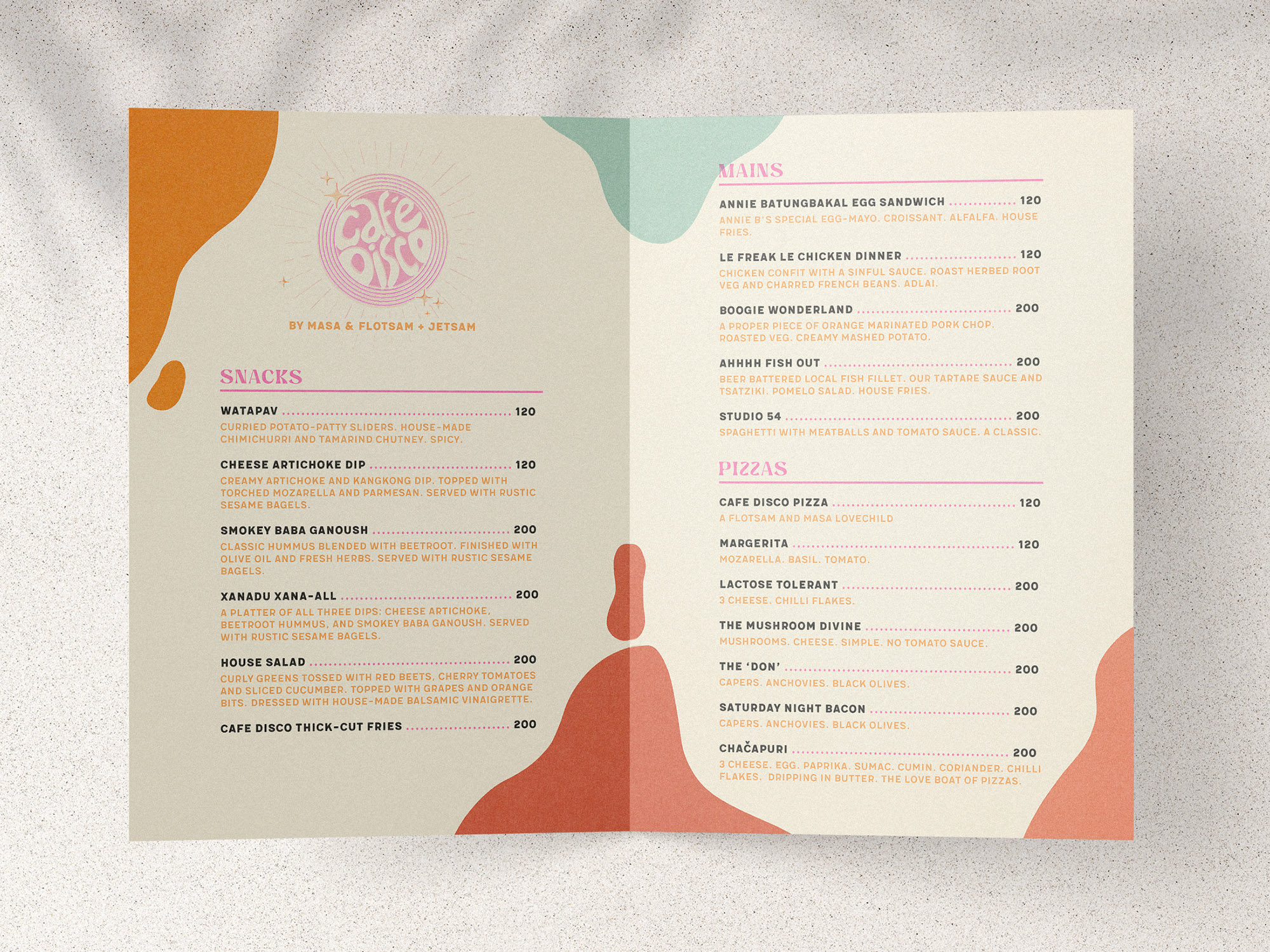
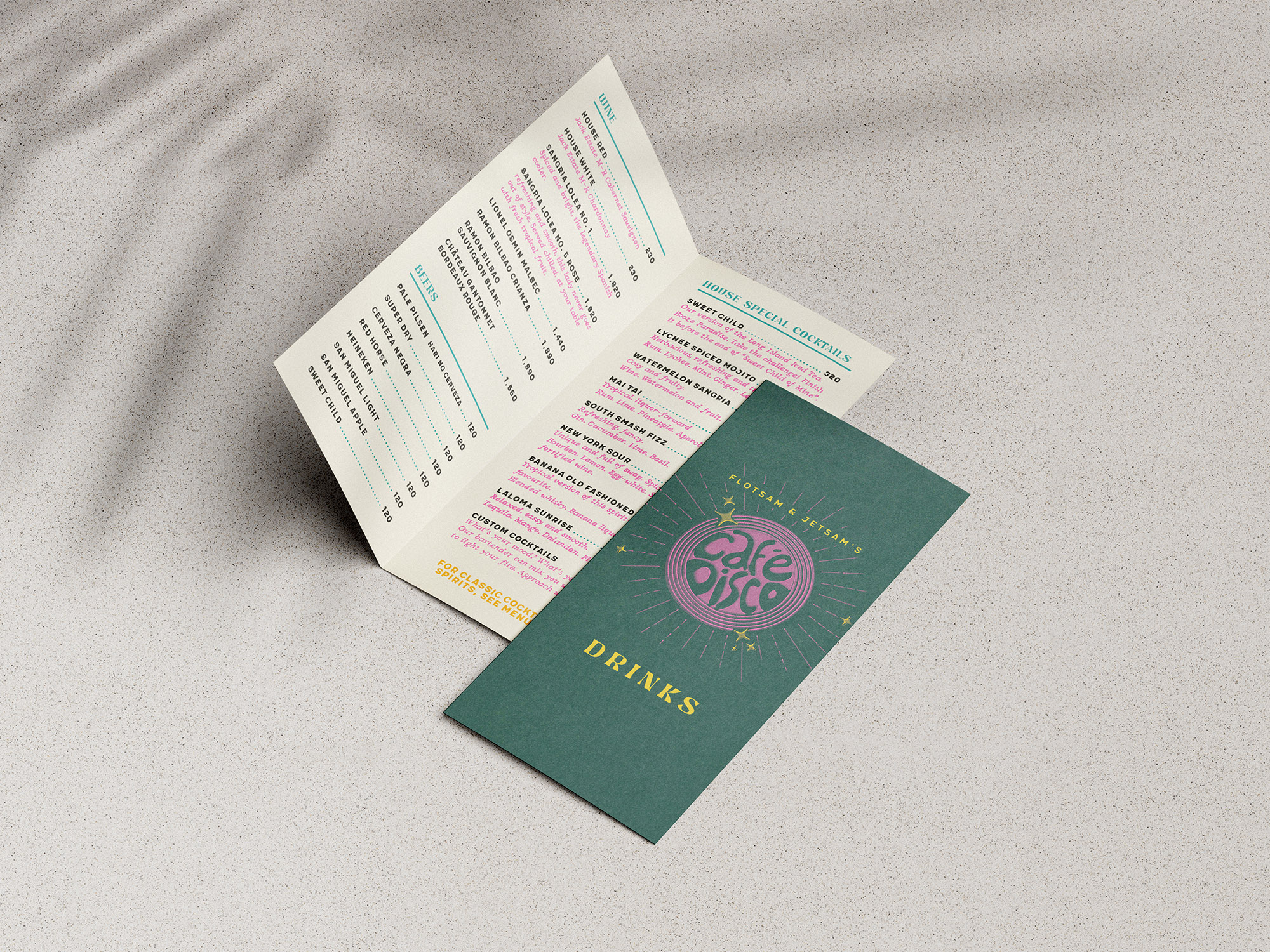
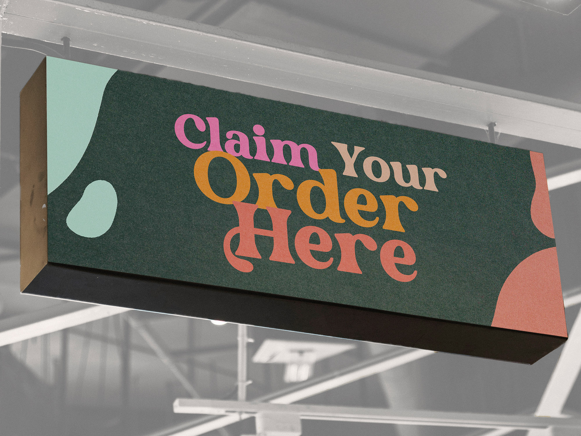
The pandemic forced F+J to pivot, closing the dancefloor and instead turn their attention to their food offerings. They approached me to help rebrand the space as "Cafe Disco", to create a chic seaside dining experience while preserving the hostel's lively pre-COVID nightlife essence.
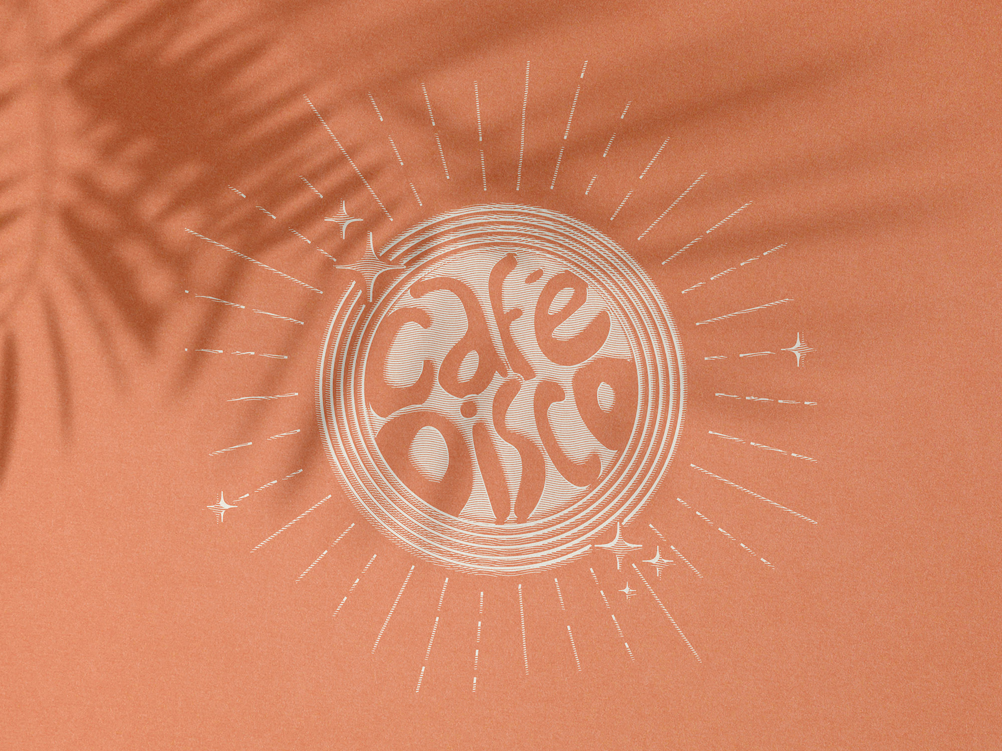
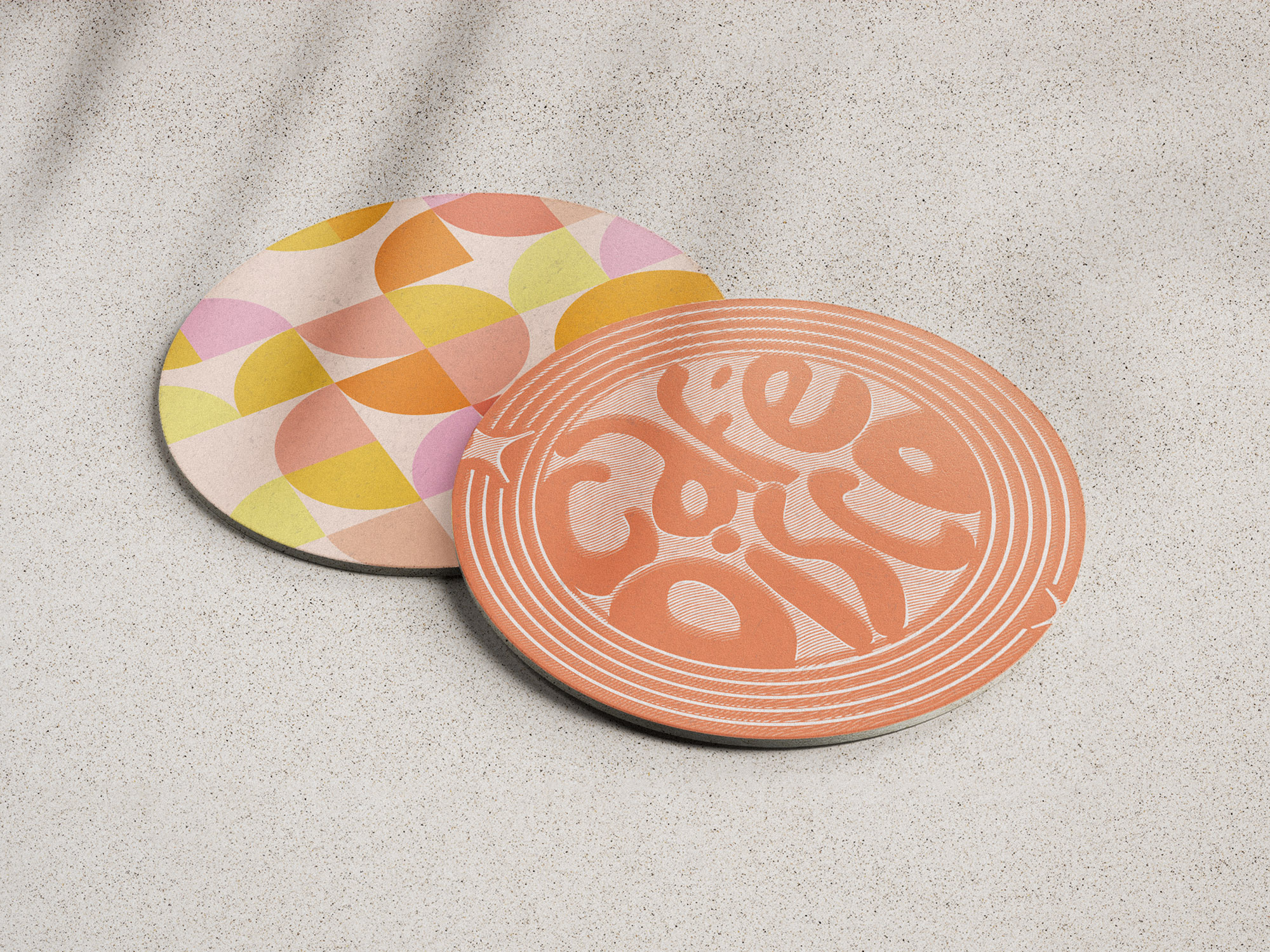
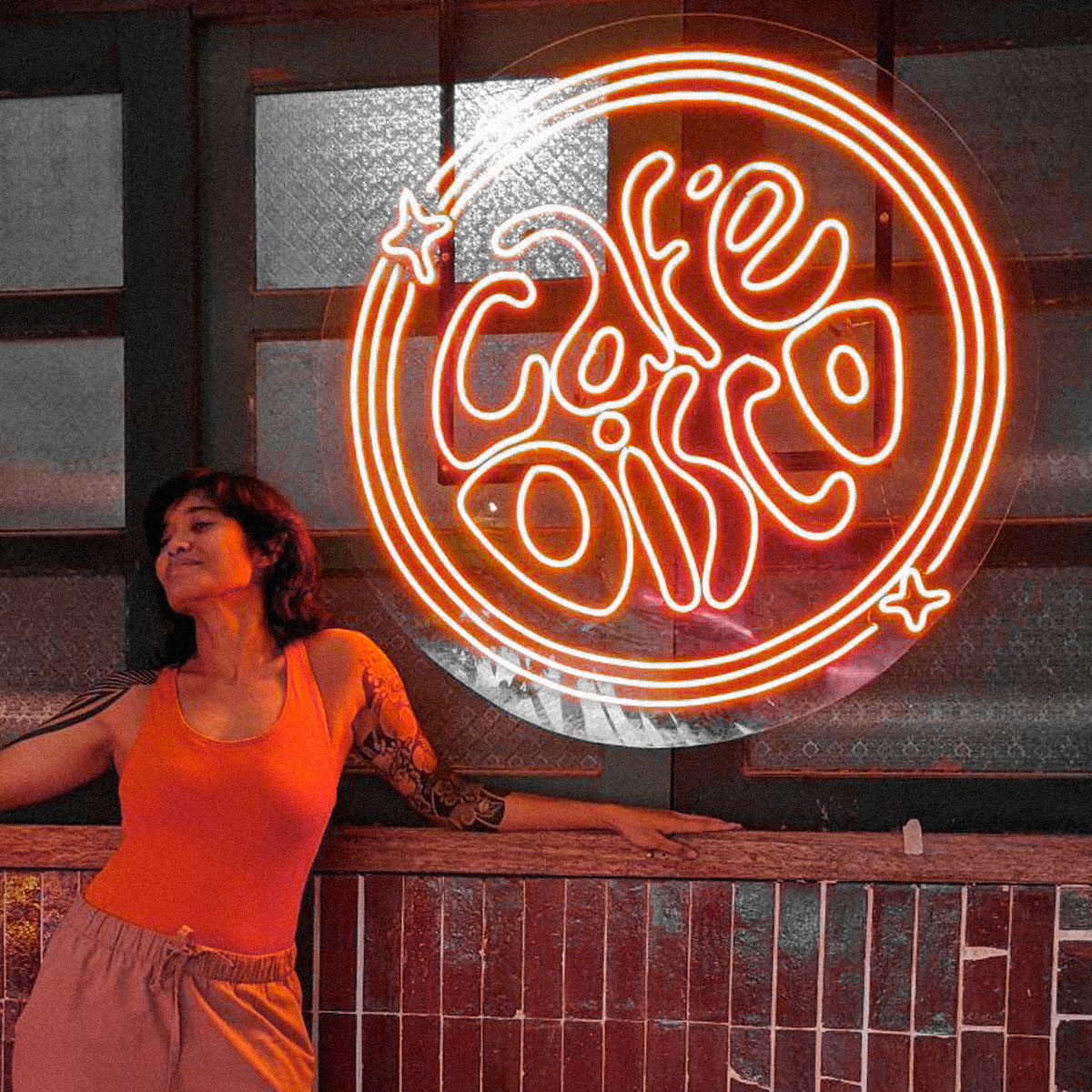
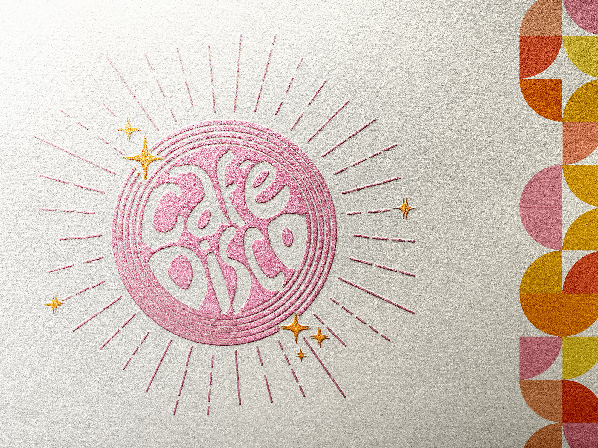
I drew inspiration from the '70s and early '80s, especially the disco era epitomized by Studio54, to honor F+J's established brand. During the restaurant's renovation, F+J retained their iconic disco ball, which prompted me to integrate it into the hand-drawn rebrand logo as a tribute to their hedonistic nightlife legacy. The logo’s rings are reminiscent of a record vinyl, a nod to the DJ booth that served as the centrepiece of their dancefloor. Transforming the logo into a neon sign solidified the disco aesthetic, achieving a whimsical fusion of retro and quirk that mirrored F+J's vision for Cafe Disco.
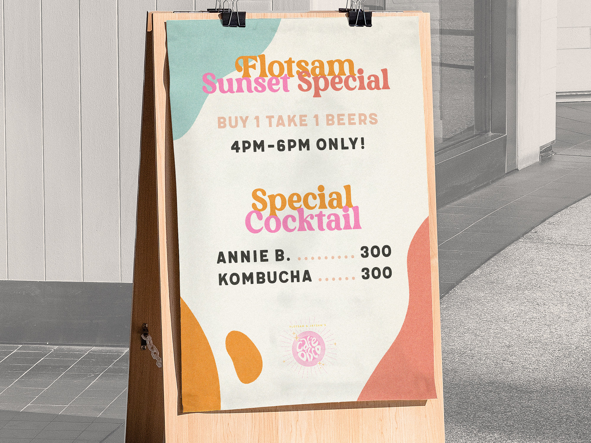
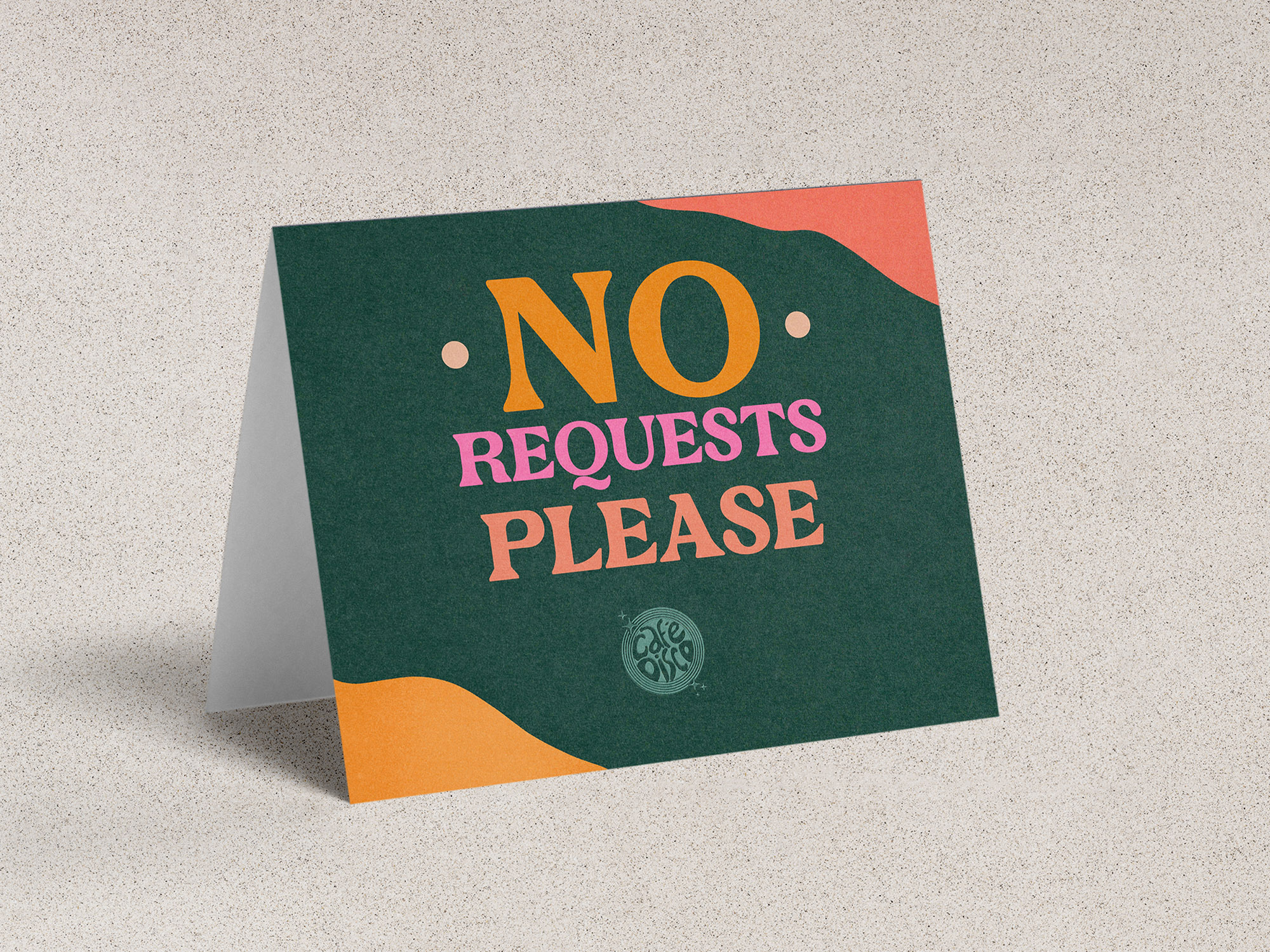
The color palette blended disco glamour with earthy tones to complement the beachside setting, while a 70s-inspired geometric pattern and playful lava-lamp shapes unified the branding elements seamlessly.